"Modern Design" is the Worst Thing to Happen to UIs
If you've ever found an application, which you enjoyed using for years, before the developers suddenly pulled the rug out from under you and forced you to suffer under the plague of developers "modernizing the UI", where now, instead of a beautiful row of buttons, you now have a single button, affectionately known as the "hamburger menu," in order to add an extra step for everything you need to do, then you have been struck by Modern UI Design.
As someone who uses mostly older software, I have remained largely unaffected by this, outside of the frequent redesigning of Firefox. But the straw that broke the camel's back is when my Android mail application, K-9, decided their beautiful UI wasn't annoying enough. Now, in order to reply to or forward an email, instead of pressing the reply/forward button, which was very conveniently in thumb range while holding the phone, I have to adjust my grip to reach the hamburger menu in the top right corner, and then keep my hand in the weird position to hit the reply/forward button in its new location. Additionally, now the settings button is no longer in perfect thumb-range, but inside a hamburger menu at the top right of the screen.
If this was isolated to this one application, then I would just get a different mail app. I'm not petty enough to get upset over a single app changing its design and complain to the internet. However, this is not isolated to K-9; in fact, K-9 has held out for longer against the impending tsuname of terrible design than most organizations, and it didn't change nearly as much as it could have. It is still fully functional, even if a little more annoying. Anyone who regularly uploads videos to YouTube knows full well how annoying "imporoving"/"modernizing" the UI can be for the end user.
One of the major culprits of this push of "modern design" is Google, with their Material Design principles, and another is Apple. Anyone using a computer for the past few years will have undoubtedly seen multiple design transitions, from skeuomorphic designs to flat ones, from sublteties to "boldness". Now, I will not say that older designs are always better (Windows 3.11, anyone?), but the principle of "the user can't handle seeing too many buttons at the same time, we need to hide them in a separate menu" is both inefficient and vexing.
I am the kind of person who loves streamlining my activities. Macros, scripts, keybindings; these are the kinds of thing I do a lot of to increase efficiency. And, as a power user, when you take configurations/featurs away (a la Firefox), or make them more annoying to get to, I get frustrated.
I cite Firefox there because Firefox is the one application I've had to deal with this the most. From changing settings without my consent, to changing configuration names so I have to figure out 1) why the configuration which was just working no longer is, and 2) how I'm supposed to fix it, Firefox has done a whole lot of downgrades trying to appeal to the average user (because I'm sure very many average users get upset that there are more advanced features which they don't know about anyways). That's not to say that there haven't been improvements, but if I can't trust my web browser to keep the settings I explicitly told it to have, then I get a new web browser. (Fortunately, Librewolf tends to mitigate this as much as feasible while still being super close to Firefox).
Another way this virus has spread is into application icons; JonTron made a video talking about this issue with company logos. Icons are being "simplified" to the point of uselessness in many cases.

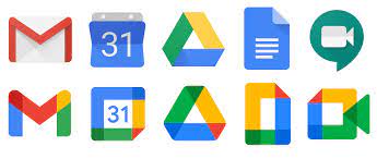
Look at this visual cacophany. The images on top are decent; you can tell the GMail logo is an envelope, the Calendar is a calendar, the Docs logo is a document, the Hangouts logo is a camera. And then look at the bottom logos: a multi-colored "m" (assumedly for mail), an annoying calendar, a rectangle with the top corner and the center missing, and the outline of a video camera. Drive is pretty much the same (it's only recognizable as Drive if you already know what it is), but now all five logos have all four Google colors. The docs logo is especially bad.

Look at this icon. Pop quiz: just by looking at it, do you know the name of this product? Do you know the company offering this product? Do you know what kind of product it even is?
Here's a hint: it is not a navigation app, despite looking like the ubiquitous "pin" usually associated with map apps.
If you said "That's obviously Mozilla VPN," you would have to either be a Mozilla fan, or employee. This does not look like an icon for a VPN, nor does it scream "Mozilla" in any way. In fact, I would argue that this icon is counter-productive, because of the confusion it could cause.
And so I conclude part one of this post, with the purely aesthetic issues I have with modern design. Stay tuned until next time, when I approach the more technological issues with this approach in part 2.